
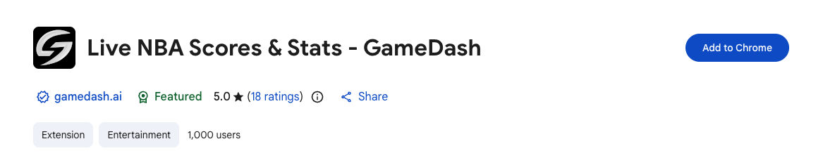

GameDash was created to enrich how NBA fans engage with games, offering real-time scores, highlights, and stats directly in their browser. Think of it as a companion for fans who like to go deeper on the action as they stream games or browse on their laptop. I partnered with the founder to evolve the user experience, create habit-forming loops, and drive growth by building directly alongside him using Cursor and Claude Code. Ultimately, my contributions helped 2x the active user count.
GameDash already had early traction with 500 active users, but there was plenty of opportunity to make the product’s value feel more immediate: helping fans understand what was happening across the NBA without opening another app, searching Google, or clicking through multiple screens.
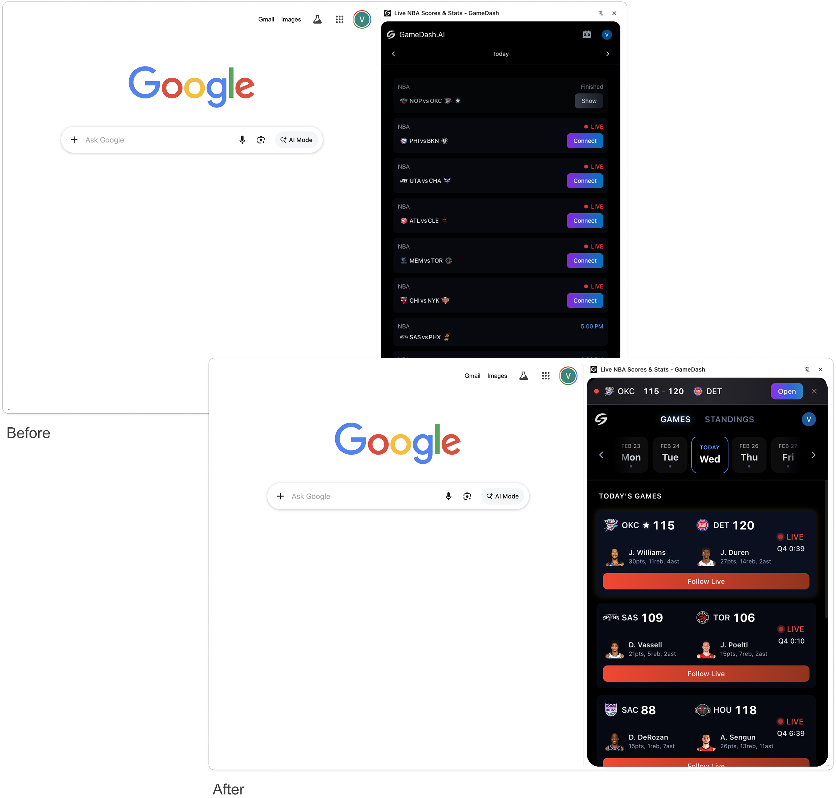
For a Chrome extension to become a habit, the value has to be obvious within seconds. GameDash could not behave like a dense sports app or require users to dig through multiple screens. The experience needed to work at a glance: live scores upfront, obvious CTAs, and timely reasons to return.
The central product question became: how do we get users to the “aha” moment as seamlessly as possible? If the core promise is live NBA stats in your browser, users should be able to see highlights and key stats before being asked to do anything else.

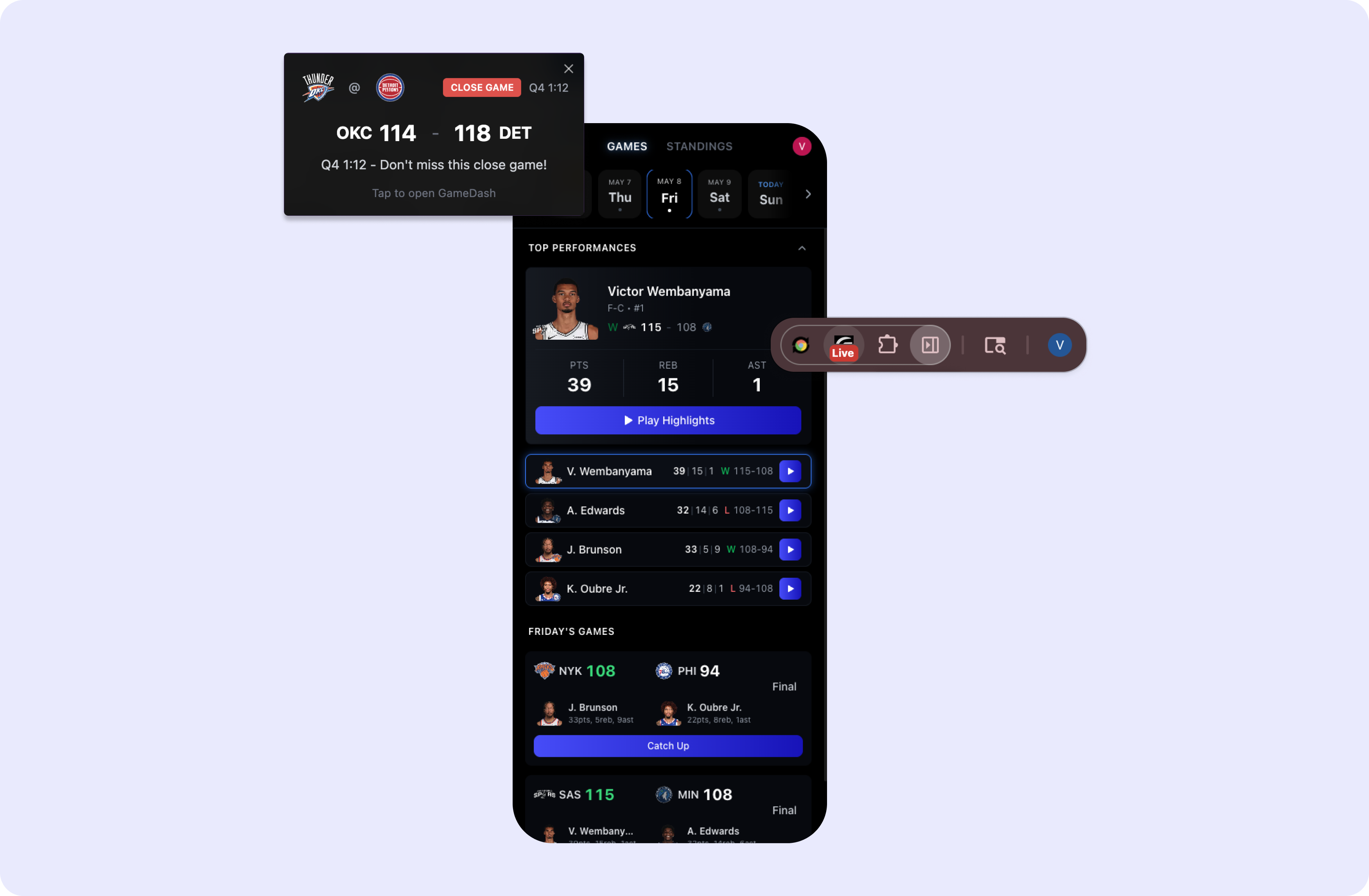
To guide the redesign, I analyzed user retention, DAU trends, and event interactions using Claude. This helped me synthesize patterns to identify where users were engaging and where they were dropping off. The analysis suggested that GameDash had strong event-driven curiosity ("I just signed up, and there's a big game tonight I want to catch up on."), but needed stronger external triggers to become a repeat habit ("I see this badge in my browser letting me know there's another game coming up soon.")
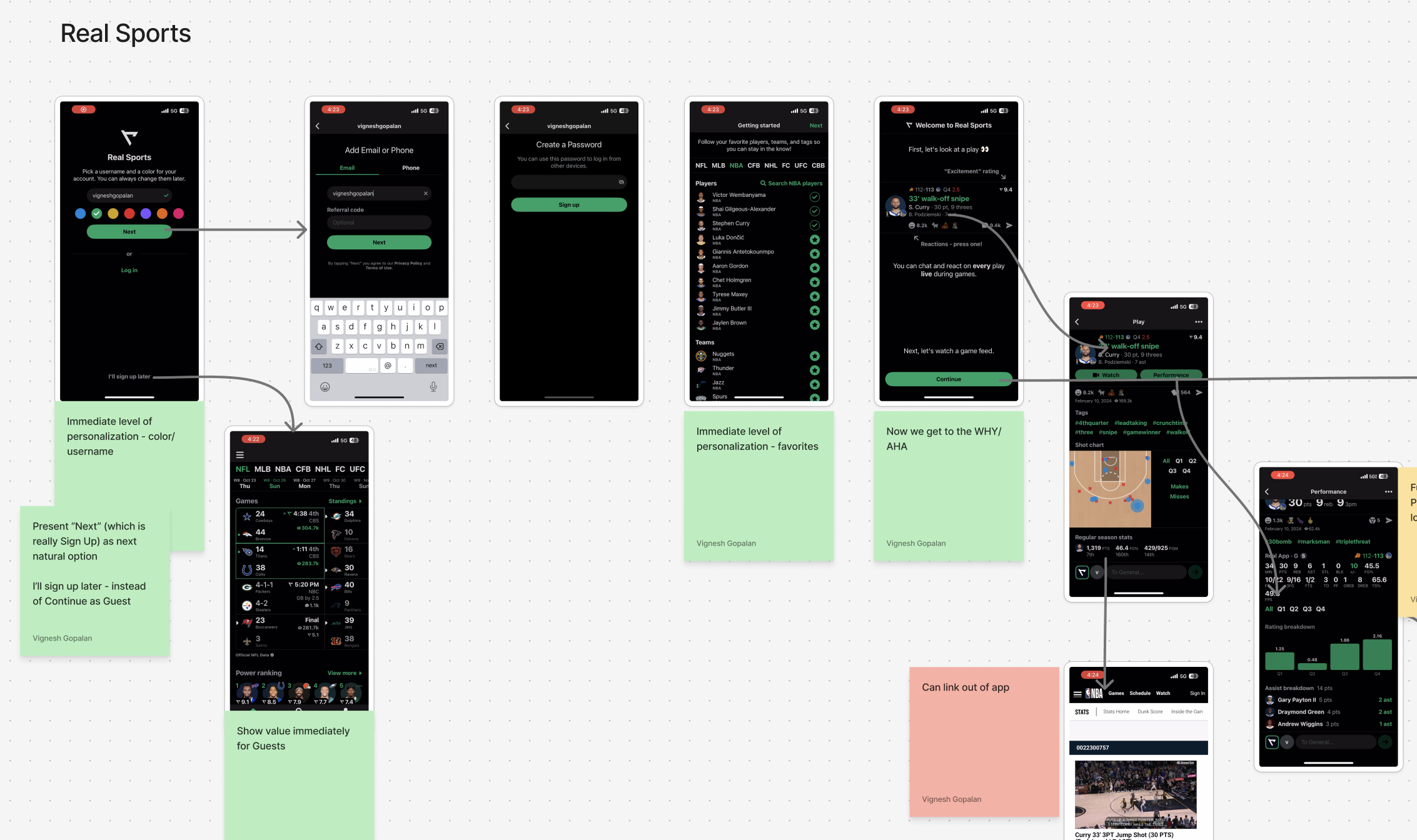
I paired those quantitative signals with direct user feedback and a competitive analysis of sports apps like Real Sports and Sleeper. The feedback validated that highlights and score data were GameDash’s core value-add, while surfacing interest in enhancements like filtering highlights by player or top moments. The competitive teardown helped clarify the level of score detail sports fans expect and highlighted UX patterns worth borrowing, like giving guest users immediate value instead of forcing a high-friction sign-up flow.
The main UX principle I pushed with the founder was simple: don’t make the user think. Every extra button, empty state, or unnecessary click created friction between the user and the reason they installed GameDash in the first place.
Those insights shaped targeted improvements across the experience: scores surfaced upfront, clearer CTAs, countdown badges, notifications, sorting games by showing favorite teams first, and playing top highlights with 1 click from Home. The goal was not to add complexity, but to make the product feel more obvious, timely, and useful every time someone opened it. Beyond Figma, I used Cursor and Claude Code to contribute directly to front-end updates, tightening the loop between ideation and shipped product.
The redesign helped GameDash become faster, clearer, and more habit-forming. By reducing click depth, adding more simplicity, and creating stronger re-engagement loops, I helped double active users from 500 to over 1,000. As I continue to partner with the founder on product & design strategy, we're excited to deliver upcoming enhancements like a richer onboarding experience, more targeted notifications, and AI-powered game predictions.